In the last two chapters, we saw how to work with a single variable by creating graphs and examining descriptive statistics. This chapter supports PDS Video 7.1, which shows how to explore relationships using two variables graphs. We will look at how to create three types of graphs: bar graphs, scatterplots, and box plots. We will start with bar graphs and scatterplots. The appropriate graph depends on the type of data you have. The table explains which graph to choose.
Dependent (Response) Variable
Independent (Explanatory) Variable
Categorical
Quantitative
Categorical
Bar Graph (C -> C)
Bar Graph (C -> Q)
Quantitative
Bar Graph or Box Plot (Q -> C)
Scatterplot (Q -> Q)
Most of the variables that you will be using in each of the three datasets will be best presented as bar graphs.
Depending on the type of data you have, you may need to also use your data management skills to create these graphs. You may want to simply your graphs by creating fewer categories to make interpretation easier.
In the next section, we will examine some examples.
9.1 Bar Graphs: C -> C, Q -> C, C -> Q
9.1.1 If your categorical dependent (response) variable has two categories
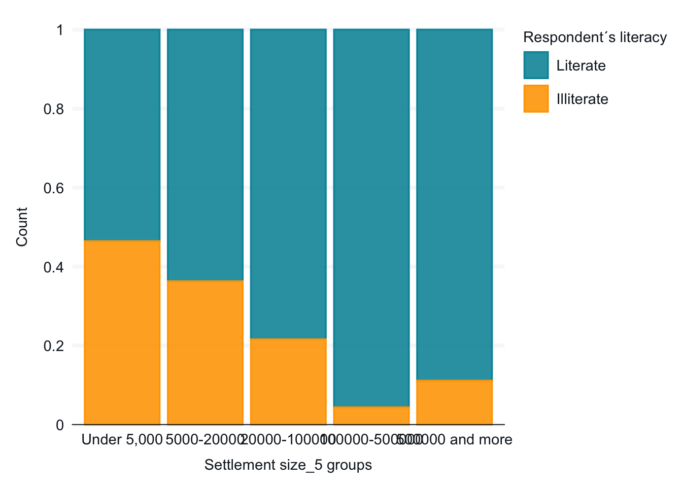
For this first example, we want to look at the relationship between town size and literacy. I hypothesize that Ethiopians living in larger towns are more likely to be literate. Let’s begin by looking at the frequencies of the two variables.
The dependent variable is literacy. It is a categorical variable with two categories. For now, the town categories work well. (We might consider whether we should combine the categories for the two largest towns since they both have few respondents.)
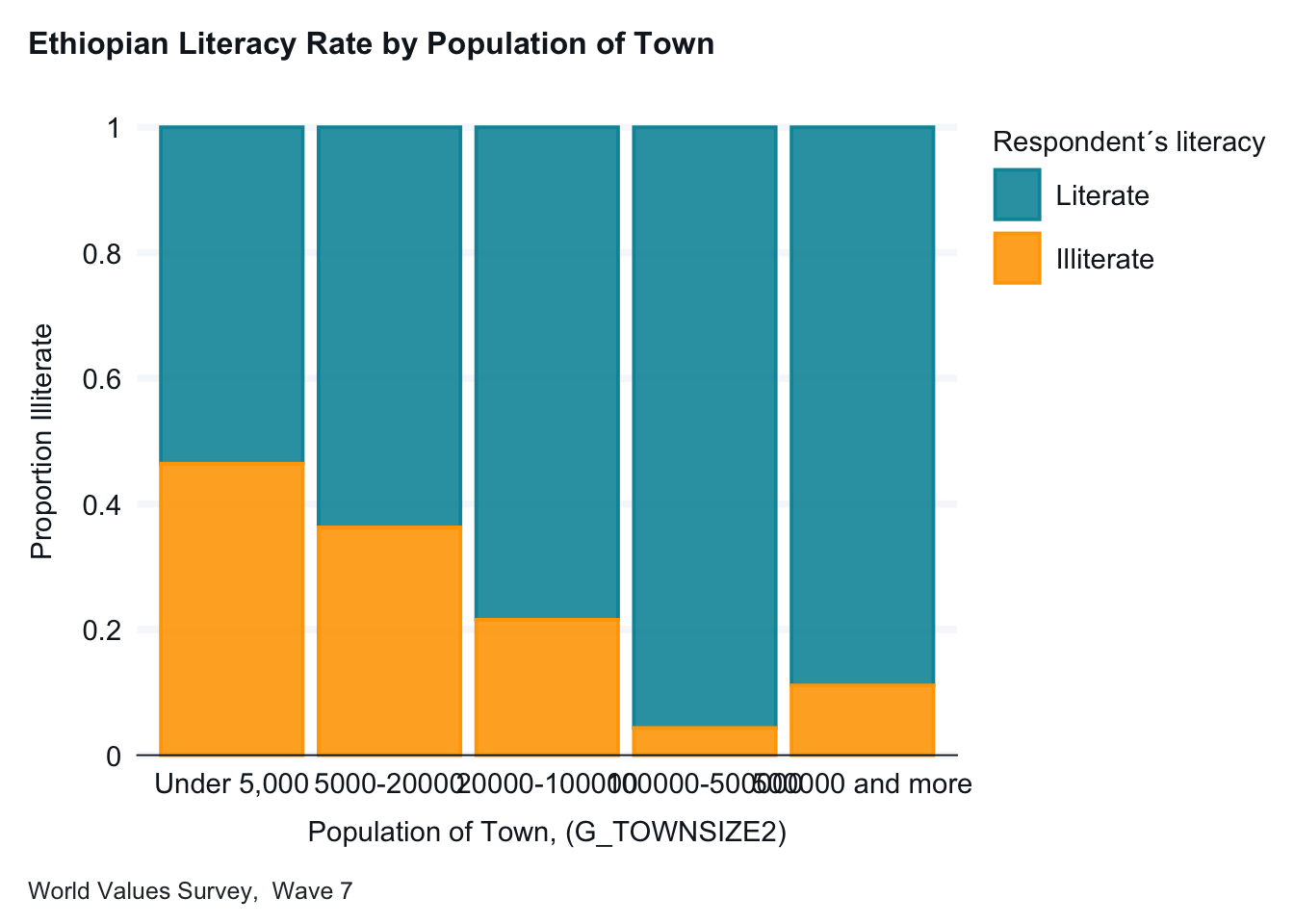
Below is our initial graph. As discussed in the PDS video, we are graphing the percentage of our dependent variable (literacy, E1_LITERACY) in each of the independent variable categories (town size, G_TOWNSIZE2). Note: We are using a different graph than used in PDS Video 7.
Interpretation: In small towns, just over 50 percent of the respondents are literate. This percentage goes up for each category except the last, towns with over 500,000 people. (There are few respondents for towns of 100,000 or more people.)
This basic plot works fine, but we will make two changes for readability. We will add axis labels and a title. The new graph below is easier for someone not familiar with the data to interpret.
ethiopia_small |>gg_bar(x = G_TOWNSIZE2,col = E1_LITERACY,position ="fill",title ="Ethiopian Literacy Rate by Population of Town",caption ="World Values Survey, Wave 7",col_title ="Literacy", x_labels = \(x) str_wrap(x, width =15) ) +labs(x ="Population of Town, (G_TOWNSIZE2)", y ="Proportion Illiterate",)
Note: A descriptive title, clearer labels and a note about where the data comes from helps readers interpret your graphs.)
9.1.2 If your categorical dependent (response) variable has more than two categories
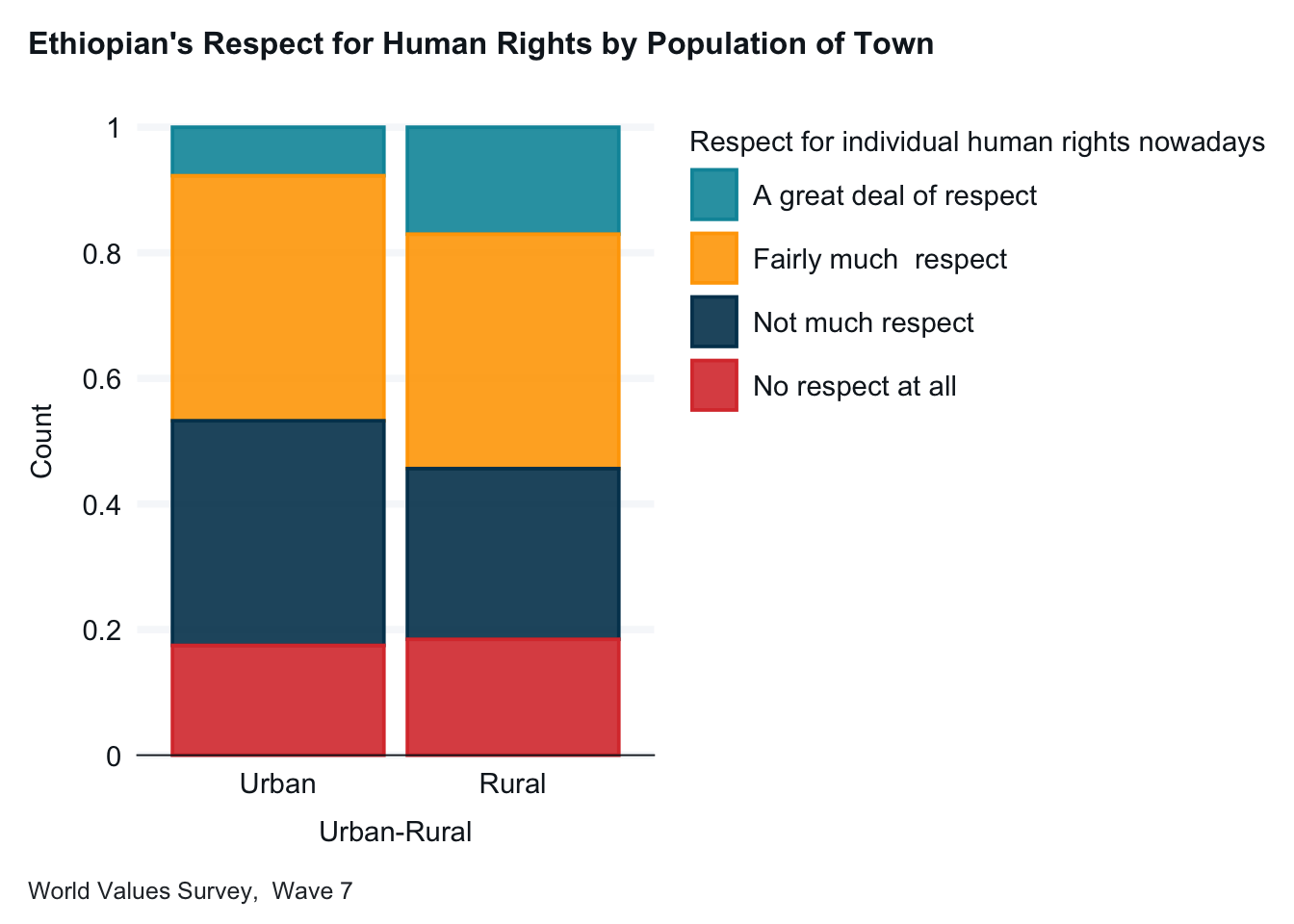
For our next example, we will investigate whether Ethiopian’s views on whether their country respects individual human rights depend on whether the respondent lives in an urban or rural environment. I hypothesize that people living in larger towns will be more likely to say that Ethiopia respects human rights. Attitude on human rights (Q253) is our dependent variable. Let’s look at the frequency.
frq(ethiopia_small$Q253)
Respect for individual human rights nowadays (x) <categorical>
# total N=1230 valid N=1215 mean=2.51 sd=0.93

Value                   |   N | Raw % | Valid % | Cum. %
--------------------------------------------------------
A great deal of respect | 169 | 13.74 |   13.91 |  13.91
Fairly much  respect    | 468 | 38.05 |   38.52 |  52.43
Not much respect        | 371 | 30.16 |   30.53 |  82.96
No respect at all       | 207 | 16.83 |   17.04 | 100.00
<NA>                    |  15 |  1.22 |    <NA> |   <NA>
I have gone ahead and added the title, axis labels, a caption, and a simpler theme.
ethiopia_small |>drop_na() |>gg_bar(x = H_URBRURAL,col = Q253,position ="fill",title ="Ethiopian's Respect for Human Rights by Population of Town",x_title ="Urban or Rural? (H_URBRURAL)", y_title ="Proportion",caption ="World Values Survey, Wave 7", x_labels = \(x) str_wrap(x, width =15) )
Interpretation: This graph is more complicated to interpret than the last example. Stacked bars with more than two categories can be tricky. It is often helpful to produce a table as well. (We will talk more about continengy tables in the next chapter.) It looks like there is a difference between urban and rural Ethiopians. Rural Ethiopians being more likely to think that their country respects human rights than urban Ethiopians.)
9.1.3 Recoding your categorical independent (explanatory) variable so that it has fewer categories
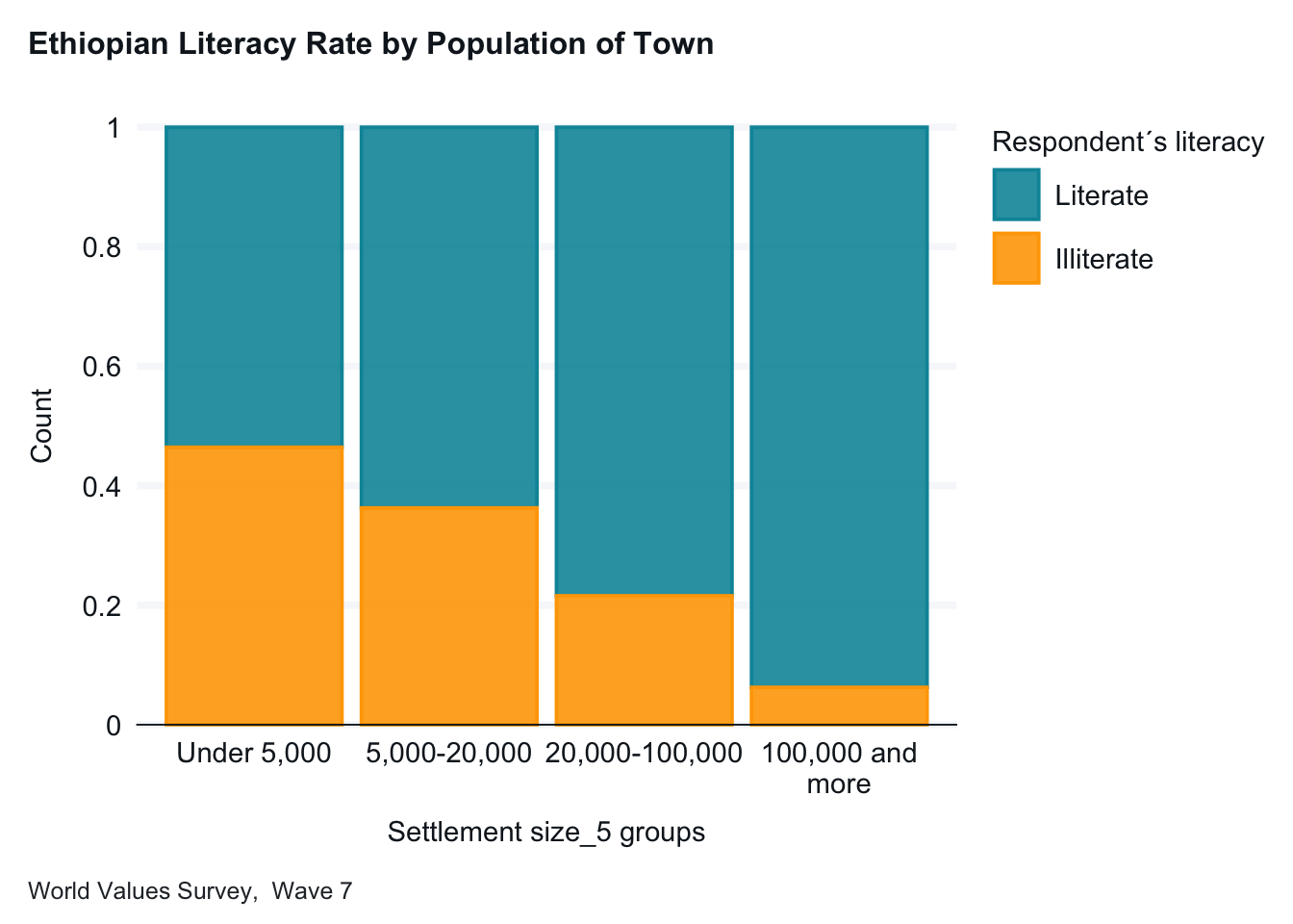
Let’s return to our first example and reexamine the relationship between town size and literacy. I hypothesized that Ethiopians living in larger towns are more likely to be literate. Let’s begin by again looking at the frequencies of the two variables.
In looking at our independent variable, town size (G_TOWNSIZE2), we may want to simplify the graph by collapsing categories. The categories for “100000-500000” people and “500000 and more” people each have few respondents, let’s combine them. We will use fct_collapse command in the forcats package to do this. Note: forcats is part of the tidyverse.) We recode and clean up the value labels.
ethiopia_small$G_TOWNSIZE2_recode <-fct_collapse(ethiopia_small$G_TOWNSIZE2, "Under 5,000"=c("Under 5,000"), "5,000-20,000"=c("5000-20000"),"20,000-100,000"=c("20000-100000"),"100,000 and more"=c("100000-500000", "500000 and more"))frq(ethiopia_small$G_TOWNSIZE2)
Settlement size_5 groups (x) <categorical>
# total N=1230 valid N=1230 mean=2.18 sd=0.72

Value            |   N | Raw % | Valid % | Cum. %
-------------------------------------------------
Under 5,000      | 196 | 15.93 |   15.93 |  15.93
5,000-20,000     | 645 | 52.44 |   52.44 |  68.37
20,000-100,000   | 357 | 29.02 |   29.02 |  97.40
100,000 and more |  32 |  2.60 |    2.60 | 100.00
<NA>             |   0 |  0.00 |    <NA> |   <NA>
ethiopia_small |>gg_bar(x = G_TOWNSIZE2_recode,col = E1_LITERACY,position ="fill",title ="Ethiopian Literacy Rate by Population of Town",x_title ="Population of Town, (G_TOWNSIZE2_recode)", y_title ="Proportion Illiterate",caption ="World Values Survey, Wave 7",x_labels = \(x) str_wrap(x, width =15) )
Interpretation: With only four categories, this graph is now simpler to interpret. We see a notable increase in literacy by town size. In small communities, the literacy rate is about 55%, while in cities of 100,000 or more people, the literacy rate is about 85%.)
9.1.4 Adding a Third Variable
We can add a third variable by using a “facet =” attribute.
ethiopia_small$G_TOWNSIZE2_recode <-fct_collapse(ethiopia_small$G_TOWNSIZE2, "Under 5,000"=c("Under 5,000"), "5,000- 20,000"=c("5000-20000"),"20,000- 100,000"=c("20000-100000"),"100,000 and more"=c("100000-500000", "500000 and more"),)frq(ethiopia_small$G_TOWNSIZE2)
Settlement size_5 groups (x) <categorical>
# total N=1230 valid N=1230 mean=2.18 sd=0.72

Value            |   N | Raw % | Valid % | Cum. %
-------------------------------------------------
Under 5,000      | 196 | 15.93 |   15.93 |  15.93
5,000- 20,000    | 645 | 52.44 |   52.44 |  68.37
20,000- 100,000  | 357 | 29.02 |   29.02 |  97.40
100,000 and more |  32 |  2.60 |    2.60 | 100.00
<NA>             |   0 |  0.00 |    <NA> |   <NA>
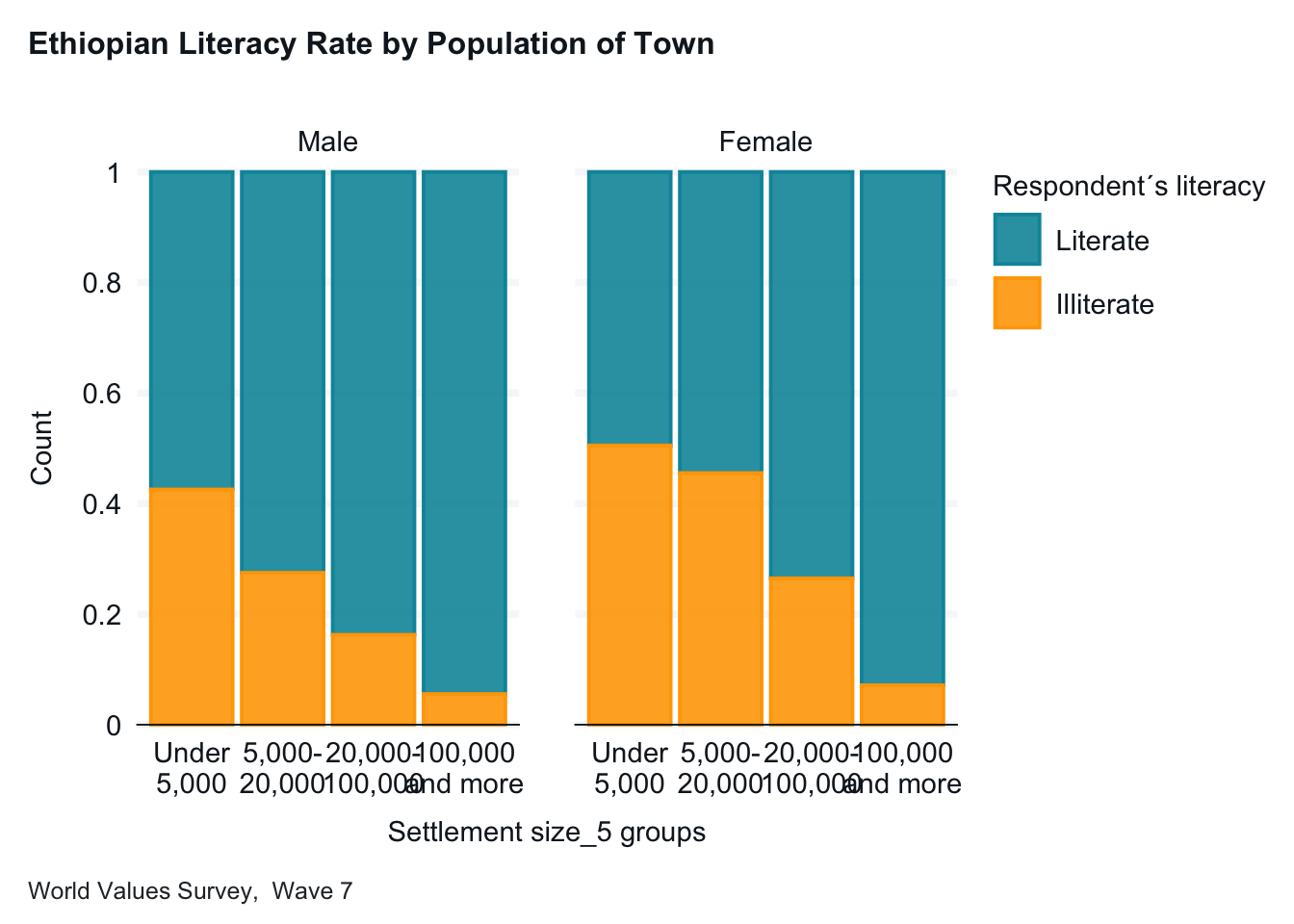
ethiopia_small |>gg_bar(x = G_TOWNSIZE2_recode,col = E1_LITERACY,facet = Q260,position ="fill",title ="Ethiopian Literacy Rate by Population of Town",x_title ="Population of Town, (G_TOWNSIZE2_recode)", y_title ="Proportion Illiterate",caption ="World Values Survey, Wave 7",x_labels = \(x) str_wrap(x, width =8) )
Interpretation: For each town size, women are more likely to be illiterate than men. )
9.1.5 Creating a bar chart with a quantitative dependent (response) variable
One final example. I want to explore if attitudes about scientists vary depending on a respondents education. I hypothesize that they those with higher education will be more likely to have positive attitudes toward scientists. . The two variables that can help us examine this are in the 2020 ANES, V202173 is the scientist feeling thermometer and V201511x is level of education. V202173 is a quantitative variable. V201511x is a categorical variable. Let’s look at the frequency of the quantitative variableto see if it needs to be recoded.
This quantititave variable ranges from 0 to 100. We need to convert this to a categorical variable. We will convert it into 3 groups using case_when in a mutate command.
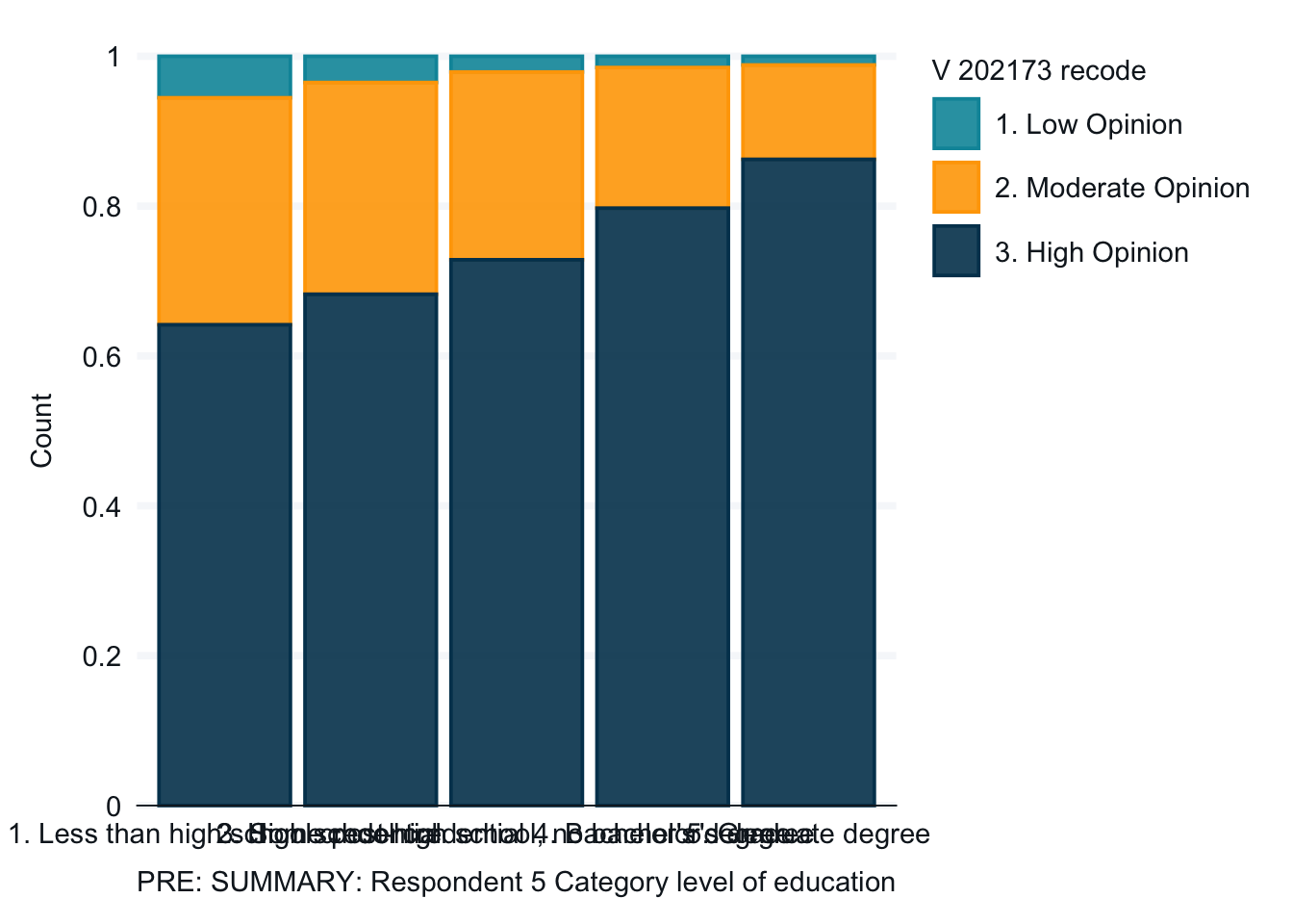
Finally, we will create the graph. The graph is complete, but not easy to read because the lables overlap and we don’t have a title and other helpful captions. The second and third graphs clean up the labels.
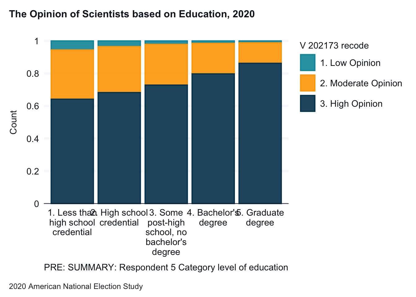
anes_2020_smaller |>drop_na(V201511x, V202173_recode) |>gg_bar(x = V201511x, col = V202173_recode,position ="fill", x_labels = \(x) str_wrap(x, width =15),title ="The Opinion of Scientists based on Education, 2020",x_title ="Education", y_title ="Percent of Opinion of Scientists",caption ="2020 American National Election Study",col_title ="Opinion of Scientists" )
Note: Again, the titles and labels make the graphs easier to understand and interpret.
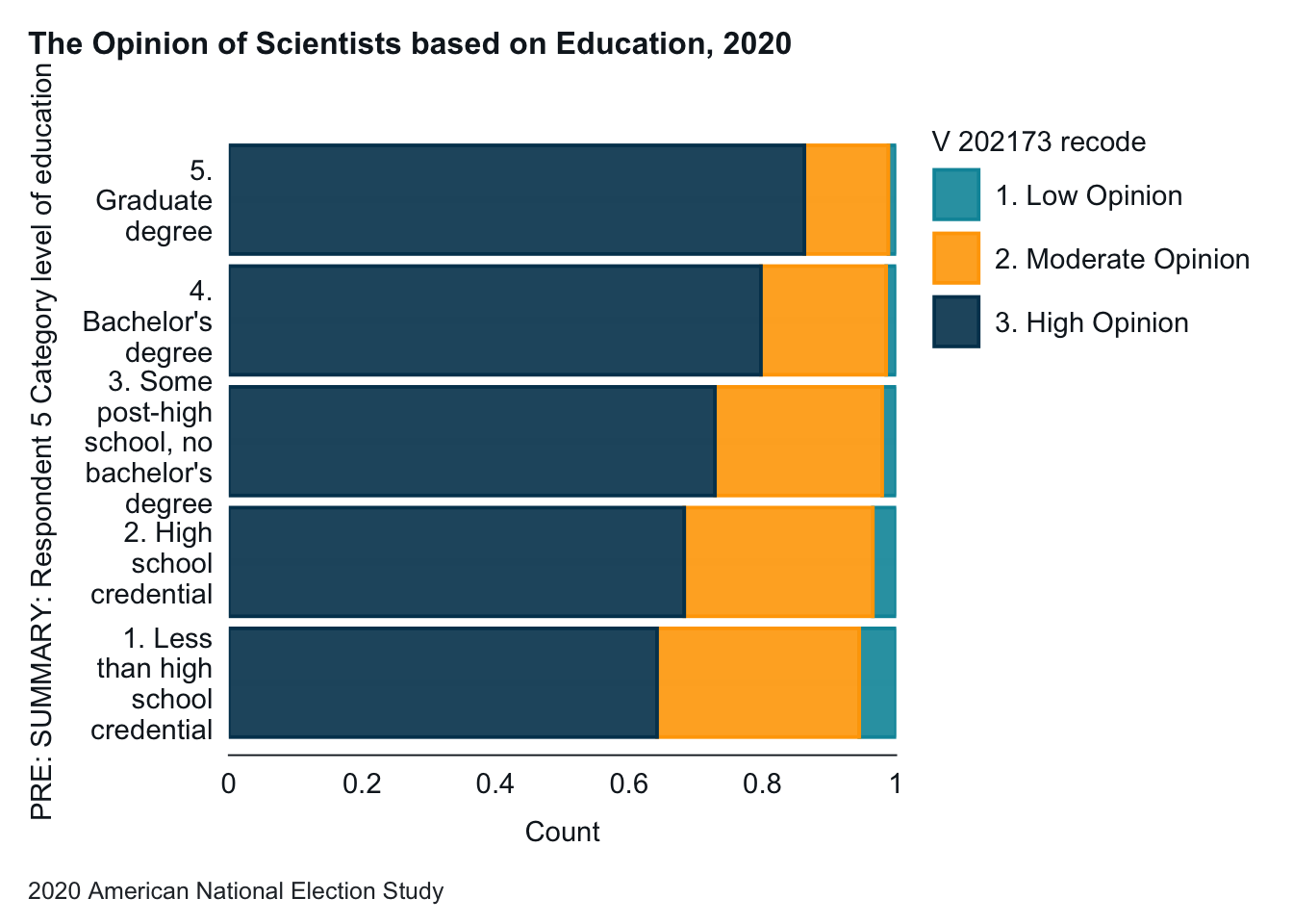
anes_2020_smaller |>drop_na(V201511x, V202173_recode) |>gg_bar(x = V201511x, col = V202173_recode,position ="fill", x_labels = \(x) str_wrap(x, width =10),title ="The Opinion of Scientists based on Education, 2020",x_title ="Education", y_title ="Percent of Opinion of Scientists",caption ="2020 American National Election Study",col_title ="Opinion of Scientists" ) +coord_flip()
Note: Flipping the axes is another way to improve graph readability. Whether this graph or the one above is easier to read is a matter of taste.
9.2 Scatterplot: Q -> Q
You create a scatterplot when you want to examine the relationship between two quantitative variables. To ease interpretation, you should place the independent (explanatory) variable along the x-axis, and the dependent (response) variable along the y-axis. Since almost all of the data you have is categorical, you likely won’t need to create a scatterplot, but here is an example.
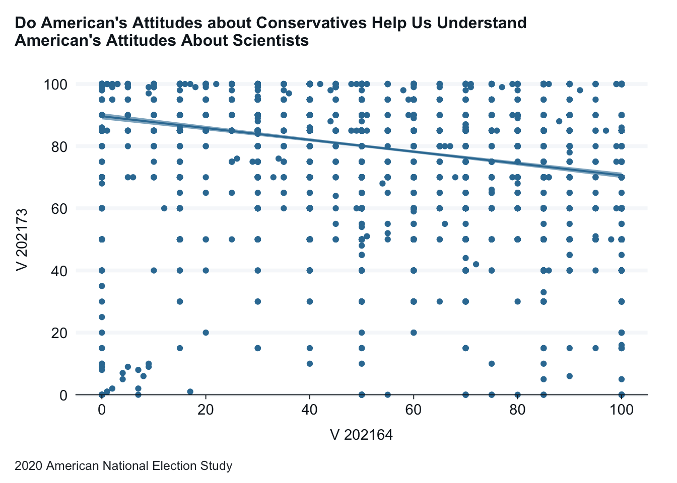
Using the 2020 American National Election study, let’s examine the relationship between the percentage attitudes about conservatives (the independent variable) and attitudes about scientists (the dependent variable).
anes_2020_smaller <- anes_2020_smaller |>mutate(V202164 =case_when(V202164 >100~100,TRUE~ V202164))anes_2020_smaller |>gg_point(x = V202164,y = V202173,title ="Do American's Attitudes about Conservatives Help Us Understand \nAmerican's Attitudes About Scientists",x_title ="Conservatives Feeling Thermometer", y_title ="Scientists Feeling Thermometer",caption ="2020 American National Election Study" ) +geom_smooth(method ="lm")
Interpretation: American’s attitudes toward scientists has a negative correlation with a person’s attitude about conservatives. The added trend line makes this interpretation easier.
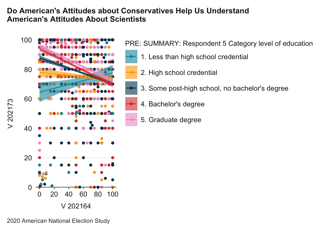
9.2.1 Adding a Third Variable
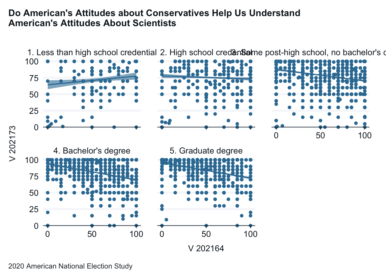
We can add a third variable to this graph in a couple of ways. One is too add a third variable by adding different colors to the data points on the graph. The second is to create multiple graphs, that are called facets in R. Both are created here. This first uses a “col =” attribute and the second uses a “facet =” attribute.
anes_2020_smaller <- anes_2020_smaller |>mutate(V202164 =case_when(V202164 >100~100,TRUE~ V202164))anes_2020_smaller |>drop_na(V201511x) |>gg_point(x = V202164,y = V202173,col = V201511x,title ="Do American's Attitudes about Conservatives Help Us Understand \nAmerican's Attitudes About Scientists",x_title ="Conservatives Feeling Thermometer", y_title ="Scientists Feeling Thermometer",caption ="2020 American National Election Study" ) +geom_smooth(method ="lm")
Interpretation: This version doesn’t help much, although we can see that the trend lines for the various groups move in different directions.
anes_2020_smaller |>drop_na(V201511x) |>gg_point(x = V202164,y = V202173,facet = V201511x,title ="Do American's Attitudes about Conservatives Help Us Understand \nAmerican's Attitudes About Scientists",x_title ="Conservatives Feeling Thermometer", y_title ="Scientists Feeling Thermometer",caption ="2020 American National Election Study" ) +geom_smooth(method ="lm")
Interpretation: In this graph the differences between people with different education levels is clearer. For those will low levels of education, there is a positive relationship between the two variables. As education level decreases, the correlation becomes increasingly negative.
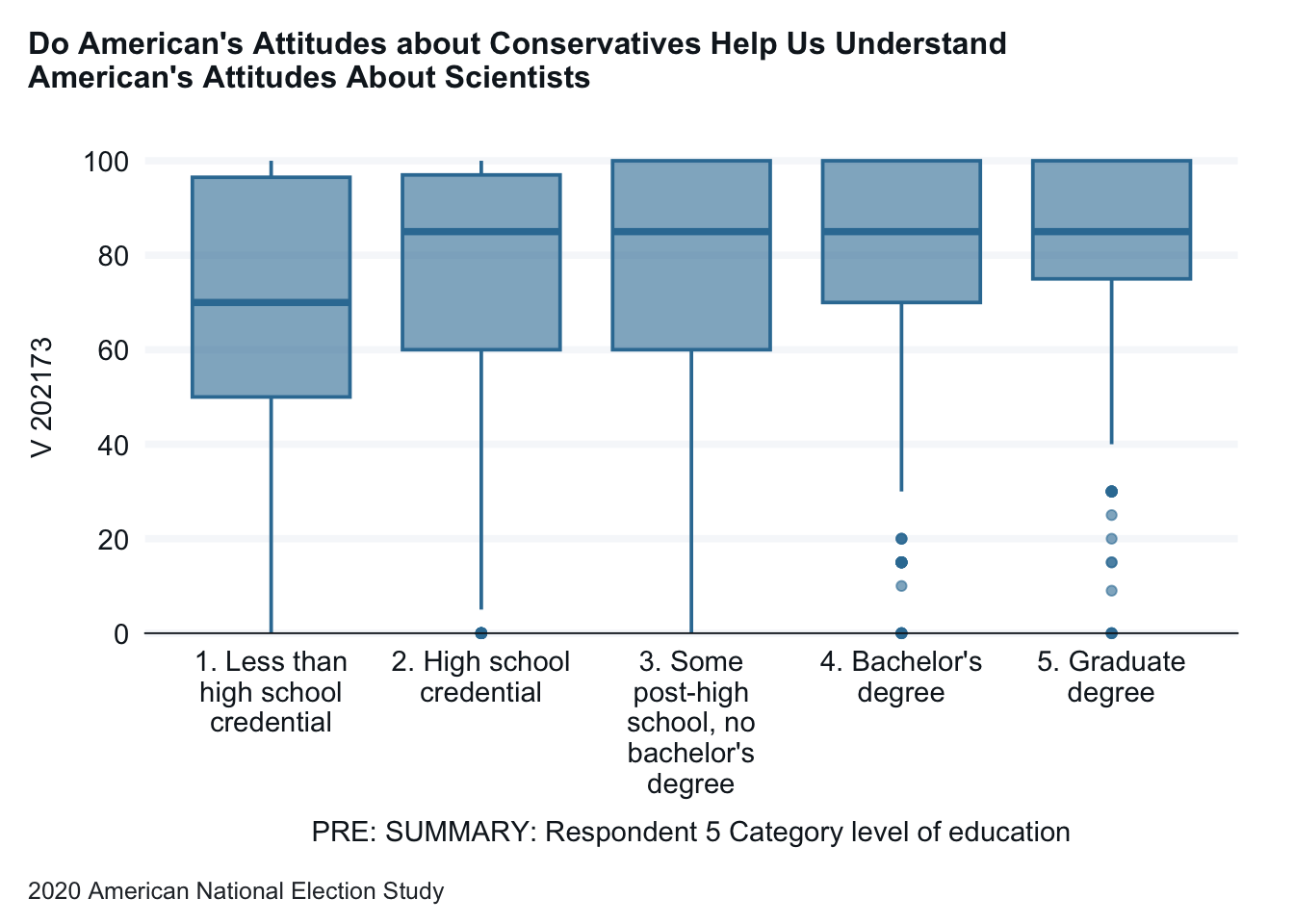
10 Box plots
A box plot allows us to look at the details of a numeric varible across a categorical variable. The top and bottom of the box are the 75th and 25th percentiles of the variable. The bar in the middle is the median. The lines show the broader range, while the dots show outliers.
anes_2020_smaller |>drop_na(V201511x) |>gg_boxplot(x = V201511x,y = V202173,title ="Do American's Attitudes about Conservatives Help Us Understand \nAmerican's Attitudes About Scientists",x_title ="Education", y_title ="Scientists Feeling Thermometer",caption ="2020 American National Election Study",x_labels = \(x) str_wrap(x, width =15), )
Interpretation: In this graph we get a different lens on the relationship between education levels and attitudes on scientists. As education levels increases to at least a high school education, the median attitude on scientists increases and then levels off. And the 25th percential consistently goes up for each higher level of education. We also see that for each education level there are a wide range of attitudes.