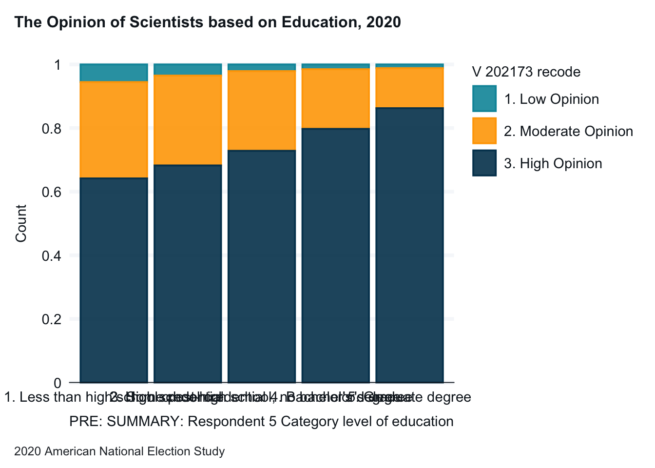
anes_2020_smaller |>drop_na(V201511x, V202173_recode) |>gg_bar(x = V201511x, col = V202173_recode,position ="fill", title ="The Opinion of Scientists based on Education, 2020",caption ="2020 American National Election Study" )
Note: This graph is a good start, but the x-axis column labels run together.
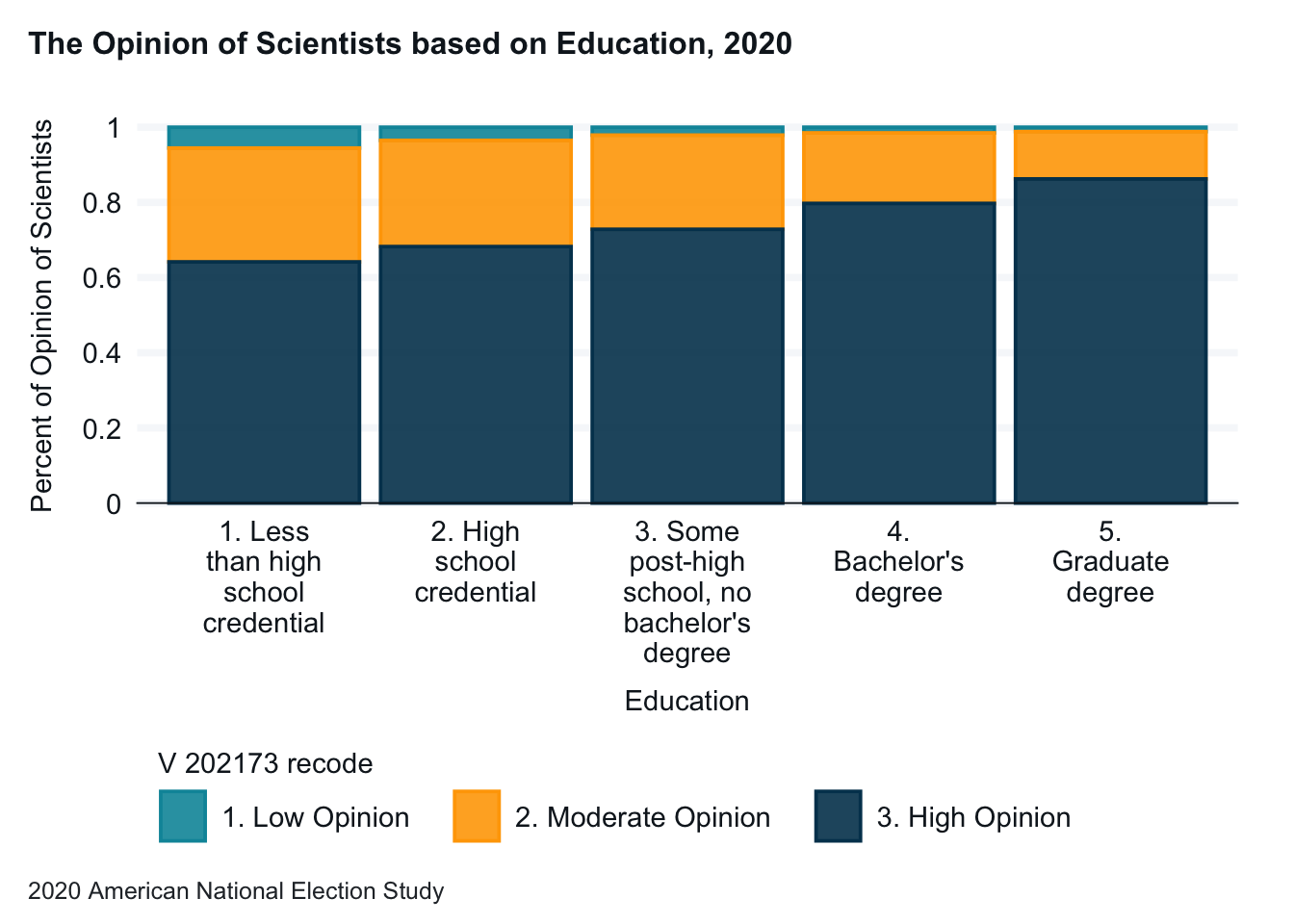
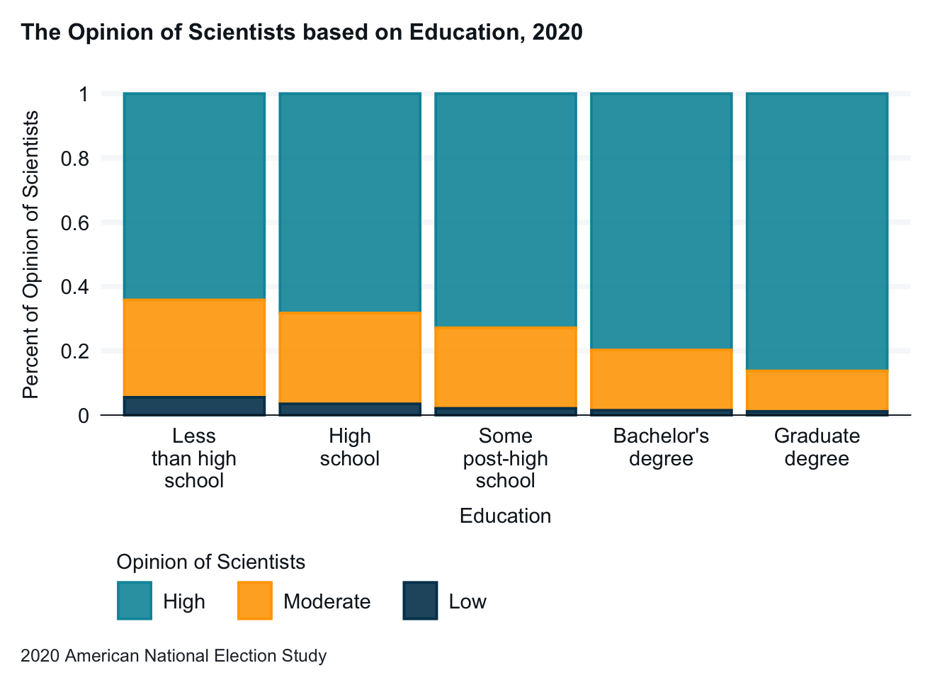
anes_2020_smaller |>drop_na(V201511x, V202173_recode) |>gg_bar(x = V201511x, col = V202173_recode,position ="fill", title ="The Opinion of Scientists based on Education, 2020",caption ="2020 American National Election Study", x_labels = \(x) str_wrap(x, width =10) ) +labs(x ="Education", y ="Percent of Opinion of Scientists")
Note: We fix the x-axis column labels with the x_labels and str_wrap commands.
13.2 Changing the Labels of the Graph X and Y Axes
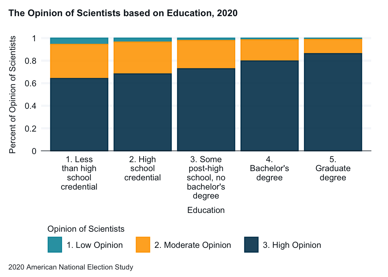
anes_2020_smaller |>drop_na(V201511x, V202173_recode) |>gg_bar(x = V201511x, col = V202173_recode,position ="fill", title ="The Opinion of Scientists based on Education, 2020",caption ="2020 American National Election Study",x_labels = \(x) str_wrap(x, width =10) ) +labs(x ="Education", y ="Percent of Opinion of Scientists")
Note: The column labels can be changed with the labs() command. Here we short the x-axis label and clarify the y-axis label.
13.3 Moving the Graph Legend
anes_2020_smaller |>drop_na(V201511x, V202173_recode) |>gg_bar(x = V201511x, col = V202173_recode,position ="fill", title ="The Opinion of Scientists based on Education, 2020",caption ="2020 American National Election Study", x_labels = \(x) str_wrap(x, width =10) ) +labs(x ="Education", y ="Percent of Opinion of Scientists") +theme(legend.position="bottom") +guides(color=guide_legend(nrow=1, byrow=TRUE))
Note: You can move your legend with the theme combined with legend.position. Moving the legend below the graph especially makes sense when the variable and value labels are long. You can also move the legend to the top, left, or right. The guides puts the values in more or fewer lines.
13.4 Shortening or Rewriting Variable Labels
This can come in handy when your:
Graph legend is too long, or
Your graph legend isn’t meaningful.
The best solution is to update your dataset so that you don’t have to fix this each time.
anes_2020_smaller <- anes_2020_smaller |>set_variable_labels(V202173_recode ="Opinion of Scientists")anes_2020_smaller |>drop_na(V201511x, V202173_recode) |>gg_bar(x = V201511x, col = V202173_recode,position ="fill", title ="The Opinion of Scientists based on Education, 2020",caption ="2020 American National Election Study", x_labels = \(x) str_wrap(x, width =10) ) +labs(x ="Education", y ="Percent of Opinion of Scientists") +theme(legend.position="bottom") +guides(color=guide_legend(nrow=1, byrow=TRUE))
Note: You can relabel variables with the set_variable_labels command. You can do this as part of a graph workflow, but it makes most sense to do update and save your dataset.
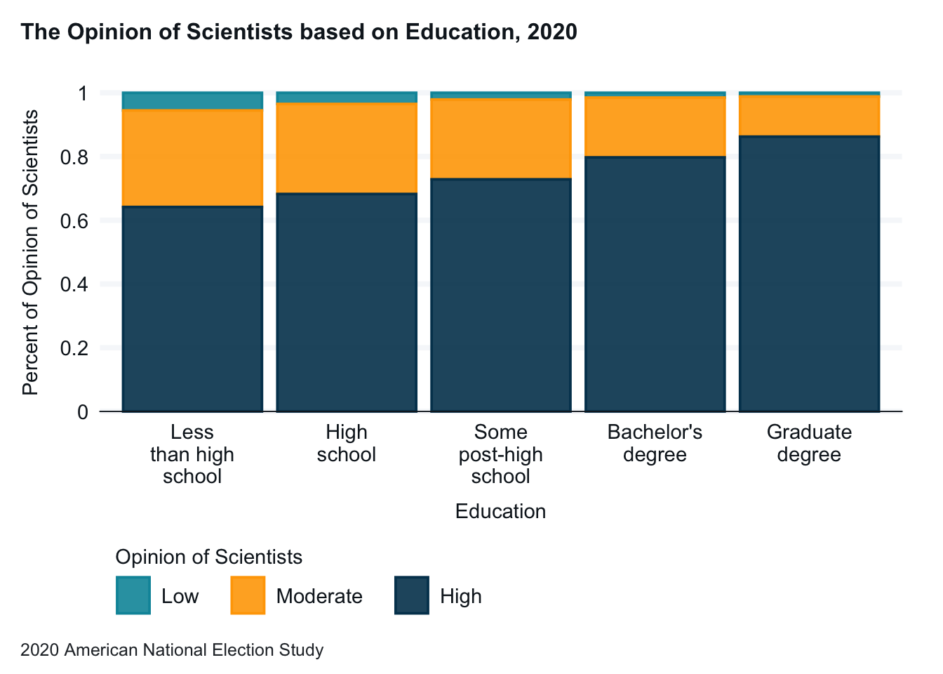
13.5 Shortening or Rewriting Value Labels
anes_2020_smaller <- anes_2020_smaller |>mutate(V202173_recode =fct_recode(V202173_recode,"Low"="1. Low Opinion","Moderate"="2. Moderate Opinion","High"="3. High Opinion"),V201511x =fct_recode(V201511x,"Less than high school"="1. Less than high school credential","High school"="2. High school credential","Some post-high school"="3. Some post-high school, no bachelor's degree","Bachelor's degree"="4. Bachelor's degree","Graduate degree"="5. Graduate degree")) anes_2020_smaller |>drop_na(V201511x, V202173_recode) |>set_variable_labels(V202173_recode ="Opinion of Scientists") |>gg_bar(x = V201511x, col = V202173_recode,position ="fill", title ="The Opinion of Scientists based on Education, 2020",caption ="2020 American National Election Study", x_labels = \(x) str_wrap(x, width =10) ) +labs(x ="Education", y ="Percent of Opinion of Scientists") +theme(legend.position="bottom") +guides(color=guide_legend(nrow=1, byrow=TRUE))
Note: You can relabel variable values with the fct_recode command. You can do this as part of a graph workflow, but it makes most sense to do update and save your dataset.
13.6 Reordering Variable Categories in a Graph
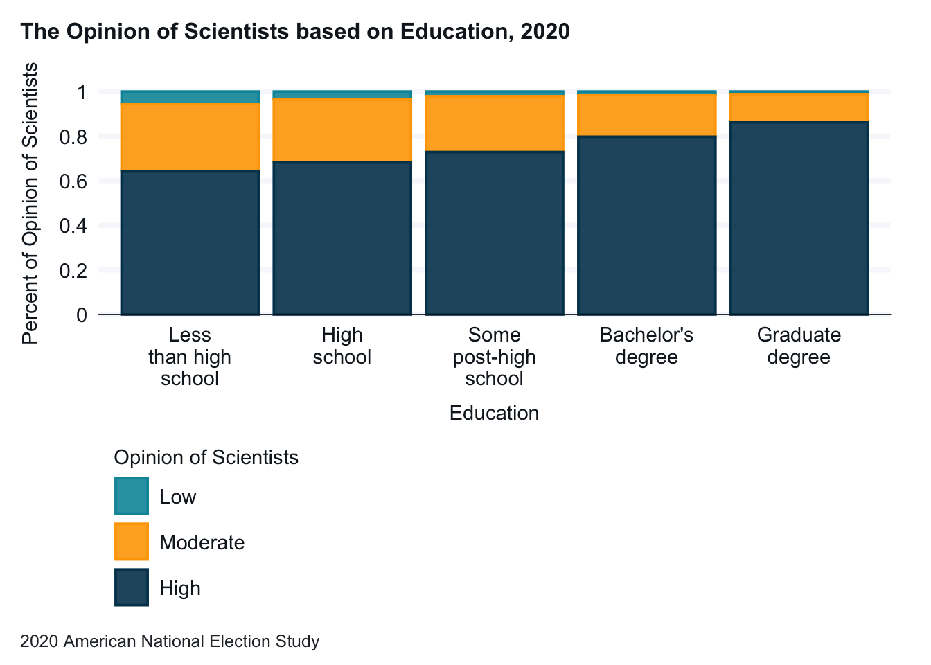
anes_2020_smaller |>drop_na(V201511x, V202173_recode) |>set_variable_labels(V202173_recode ="Opinion of Scientists") |>mutate(V202173_recode =fct_relevel(V202173_recode, "High", "Moderate", "Low")) |>gg_bar(x = V201511x, col = V202173_recode,position ="fill", title ="The Opinion of Scientists based on Education, 2020",caption ="2020 American National Election Study", x_labels = \(x) str_wrap(x, width =10) ) +labs(x ="Education", y ="Percent of Opinion of Scientists") +theme(legend.position="bottom") +guides(color=guide_legend(nrow=1, byrow=TRUE))
Note: Finally, we might want to reorder our categories. In this example we will reorder the opinion of scientists from high to low, rather than low to high as they are now. As with renaming variables and values, we can do this in the graph workflow or in the dataset. We will do the work in the graph workflow here.
13.7 Managing Labels in a Faceted Graph
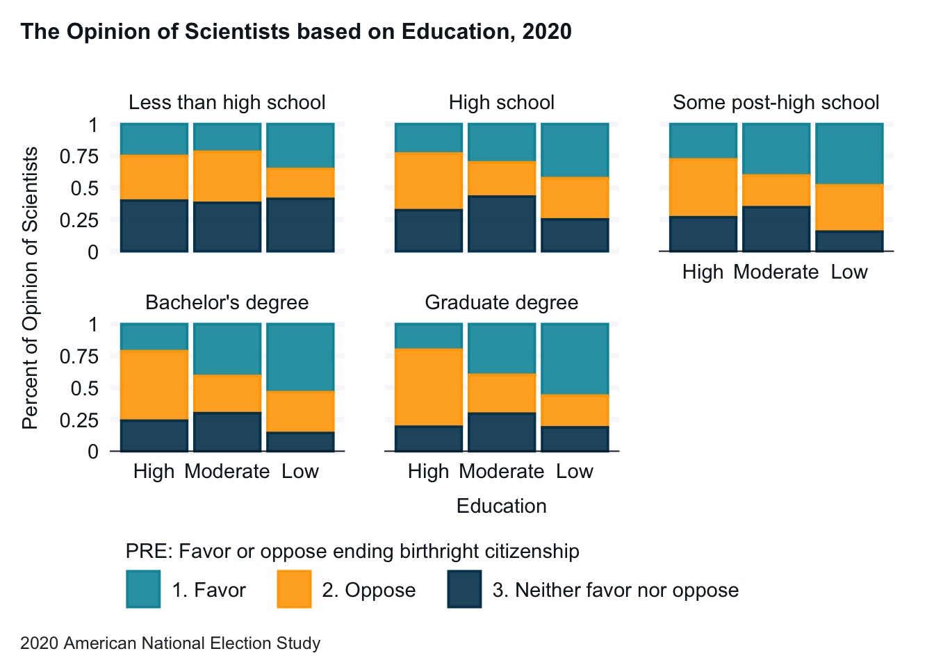
anes_2020_smaller |>drop_na(V201511x, V202173_recode, V201418) |>set_variable_labels(V202173_recode ="Opinion of Scientists") |>mutate(V202173_recode =fct_relevel(V202173_recode, "High", "Moderate", "Low")) |>gg_bar(x = V202173_recode, col = V201418,facet = V201511x,position ="fill", title ="The Opinion of Scientists based on Education, 2020",caption ="2020 American National Election Study", x_labels = \(x) str_wrap(x, width =6) ) +labs(x ="Education", y ="Percent of Opinion of Scientists") +theme(legend.position="bottom") +guides(color=guide_legend(nrow=1, byrow=TRUE)) +facet_wrap(~ V201511x, labeller =labeller(V201511x =label_wrap_gen(width =25)))
Scale for colour is already present.
Adding another scale for colour, which will replace the existing scale.
13.8 Deleting Categories You Don’t Need in a Variable
Give the file a name. (Here we are saving in png format.)
You can specify the size of the graph.
Export the graph to your OneDrive.
anes_2020_smaller |>drop_na(V201511x, V202173_recode) |>set_variable_labels(V202173_recode ="Opinion of Scientists") |>gg_bar(x = V201511x, col = V202173_recode,position ="fill", title ="The Opinion of Scientists based on Education, 2020",caption ="2020 American National Election Study", x_labels = \(x) str_wrap(x, width =10) ) +labs(x ="Education", y ="Percent of Opinion of Scientists") +theme(legend.position="bottom")