We are now going to conduct exploratory data analysis (EDA). When exploring data, it isn’t unusual to generate many graphs to look at a dataset. We want to better understand our data, so all your code and graphs should be geared towards that purpose. While we aren’t worried about creating publication-ready graphs, we do want to develop good habits, so you will learn how to label graphs for easier reading.
EDA is an important part of data analysis. You can use EDA to make discoveries about the world or, you can use EDA to ensure the quality of your data, asking questions about whether the data meets your standards or not. EDA is an iterative cycle that helps you understand what your data says. When you do EDA, you:
Generate questions about your data
Search for answers by visualizing, transforming, and/or modeling your data
Use what you learn to refine your questions and/or generate new questions
Two types of questions help make discoveries within your data. These questions are:
What type of variation occurs within my variables? (univariate analysis)
What type of covariation occurs between my variables? (bivariate analysis)
We are going to start with question 1: univariate analysis. We will be looking at two types of graphs to explore one variable.
For categorical data: the bar chart.
For quantitative data: the histogram and the box plot.
In this chpater we will look learn about one variable graphs. In the next chapter, we will examine univariate statistics.
7.1 Making graphs using R/RStudio
To make graphs we will use a simplified tidyverse package ggplot. named gg_blanket.ggplot is incredibly powerful, but it can be complicated. ggblanket allows us to keep details to a minimum. We’ll keep the details to a minimum. Should you want to learn more about ggplot, I have included some details at the end of this section. CREATE LINK. You can find more on ggblanket here.
Let’s make some graphs!
7.2 The Bar Graph: a graph for categorical variables
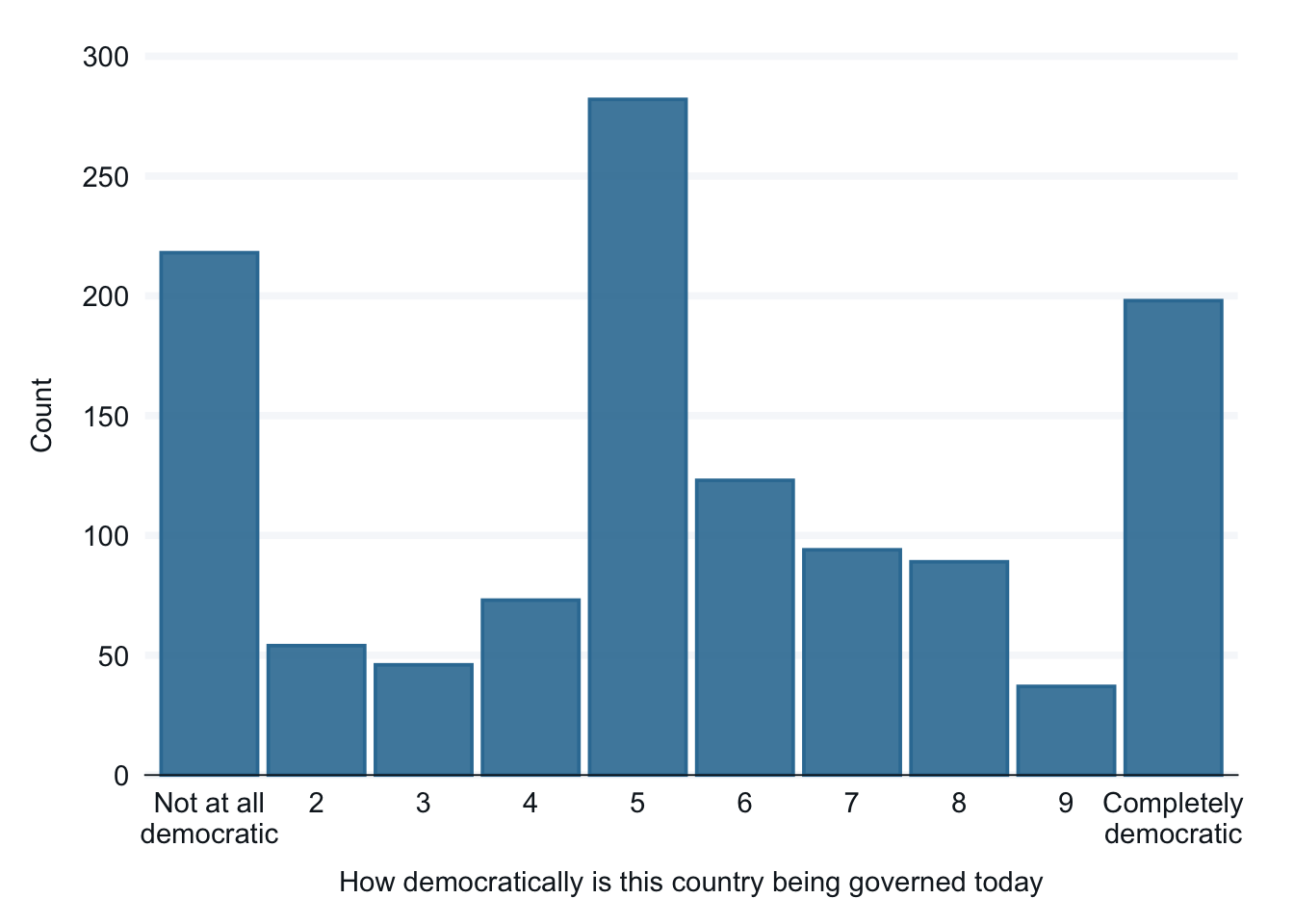
We will be using two survey questions from the the Ethiopia dataset that is part of the World Values Survey. Here are two basic bar graphs that look at the same data. Graphs can make the big picture easier to see. This is especially useful when we are beginning our research and in communicating information about our data to others, telling a story.
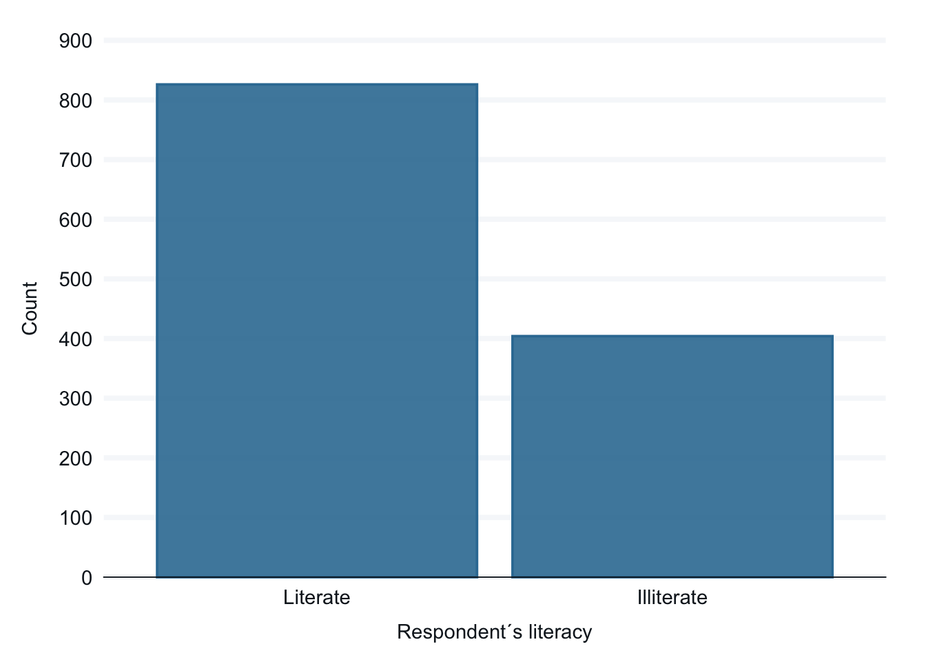
Interpretation: There is a a low literacy rate in Ehtiopia, about 1/3 of the respondents are illiterate.
7.2.1 Improving readability of the graphs
The graphs are relatively easy to understand, but with some simple additions we can improve readability, especially for a person who isn’t working in the dataet all the time. Let’s add a few elements that will improve readability:
a title,
a label on the y-axis,
a clearer label on the x-axis,
and a source of the data.
In addition we will simplify the graph on democracy to create fewer categories. Let’s start with recoding the variable from ten categories to three categories. We have already seen examples of this in earlier sections. ADD LINK. Let’s do that first.
ethiopia_small <- ethiopia_small |>mutate(Q251_recode =fct_collapse(Q251, "Not democratic"=c("Not at all democratic", 2, 3),"Somewhat democratic"=c(4, 5, 6, 7), "Democratic"=c(8, 9,"Completely democratic")))frq(ethiopia_small$Q251_recode)
How democratically is this country being governed today (x) <categorical>
# total N=1230 valid N=1214 mean=2.00 sd=0.73

Value               |   N | Raw % | Valid % | Cum. %
----------------------------------------------------
Not democratic      | 318 | 25.85 |   26.19 |  26.19
Somewhat democratic | 572 | 46.50 |   47.12 |  73.31
Democratic          | 324 | 26.34 |   26.69 | 100.00
<NA>                |  16 |  1.30 |    <NA> |   <NA>
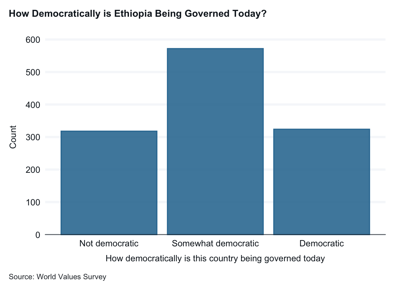
And now the two graphs with clearer labeling.
ethiopia_small |>drop_na(Q251_recode) |>gg_bar(x = Q251_recode,1title ="How Democratically is Ethiopia Being Governed Today?",x_title ="How Democratically is Ethiopia Being Governed Today? (Q 251)", y_title ="Number of Respondents", caption ="Source: World Values Survey")
1
These elements—title, x_title, y_title, and caption—all have the same format, name, equal sign (=), label in quotation marks, and a comma after the label. Don’t forget the comma after all but the last element. And don’t forget to close the parentheses!
A title, axis labels, and the caption with a source improve readability.
ethiopia_small |>drop_na(E1_LITERACY) |>gg_bar(x = E1_LITERACY,title ="Literacy in Ethiopia",x_title ="Literate or illiterate? (E1_LITERACY)", y_title ="Number of Respondents", caption ="Source: World Values Survey")
A title, axis labels, and the caption with a source improve readability.
7.2.2 Using frequency tables to examine the details
First will look at the frequency distributions using the frq command that is part of the sjmisc package. The strength of tables is that we can dig into details. We can see exactly how many people responded to each potential answer of the survey question.
7.3 The Histogram: a graph for quantitative variables
The histogram presents continuous (quantitative) data by dividing the variable into equally sized groups, called bins. Histograms allow you to see the spread and shape of the data and get a sense of the center. Is the data normally distributed, or does it have a left or right skew? (There is more about univariate statistics in chapter 5 and more about histograms here.
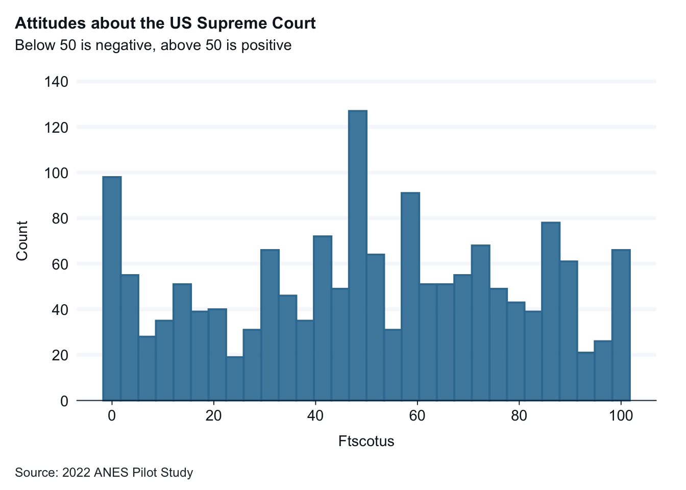
The graph below depict the distribution of responses to the question related to feelings about the Supreme Court.
anes_pilot_small |>drop_na(ftscotus) |>gg_histogram(x = ftscotus,1title ="Attitudes about the US Supreme Court",subtitle ="Below 50 is negative, above 50 is positive",x_title ="Attitude about SCOTUS (ftscotus)", y_title ="Respondents", caption ="Source: 2022 ANES Pilot Study" )
1
This graph has readability aides included: title, sub-title, axis labels, and captions with the source.
Interpretation: Attitudes about the Supreme Court vary widely from very positive to very negative.
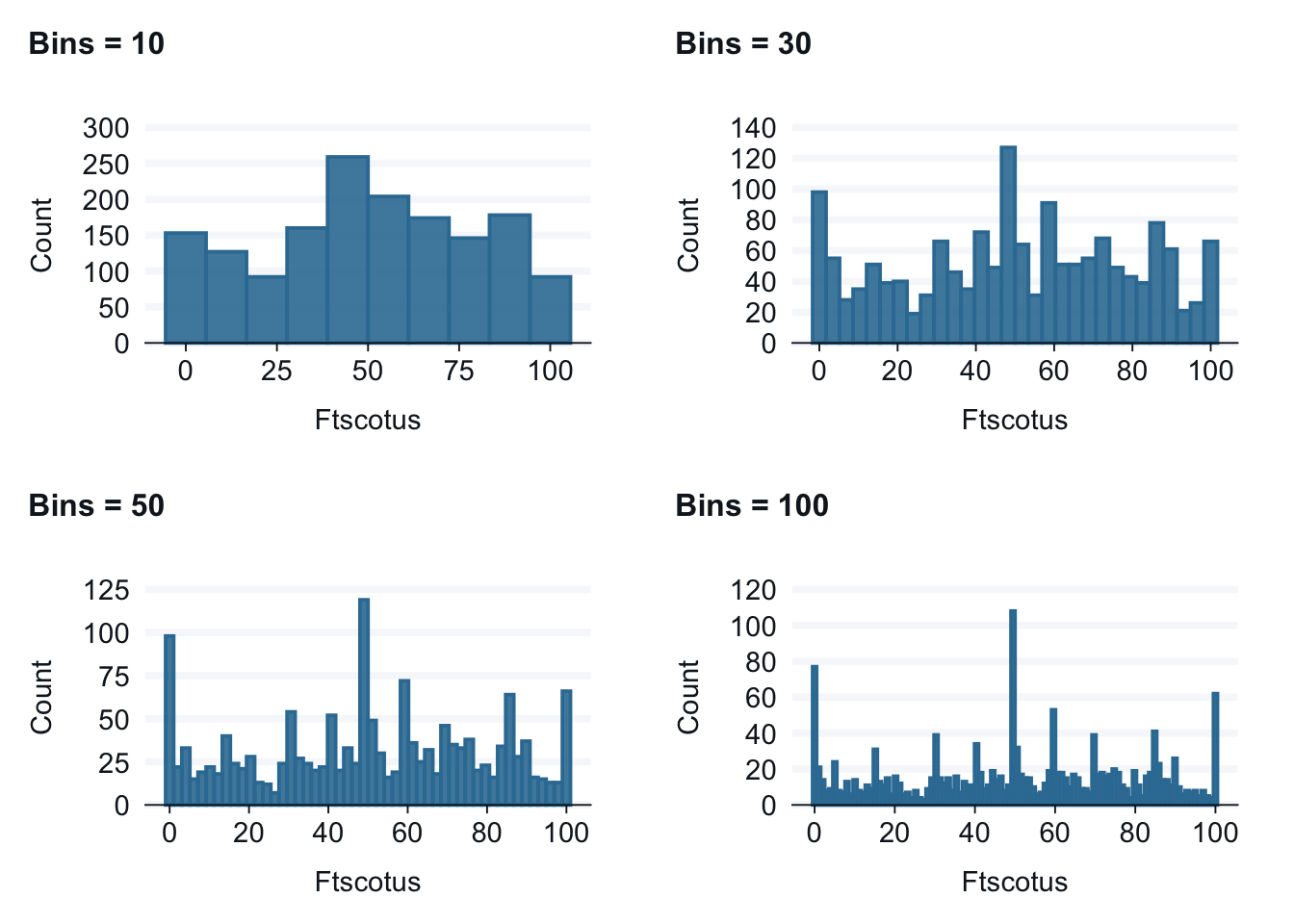
7.3.1 Changing the number of bins in a histogram
By default, gg_blanket creates 30 bins for data. This default usually works well, but it is easy to adjust the number of bins by adding the command bins = xx where xx stands for the number of bins. The graphs below present the same data on attitudes about the U.S. Supreme Court with different numbers of bins. There is no “right” number of bins, but you might want explore how the number of bins changes the data.
7.4 More about ggplot
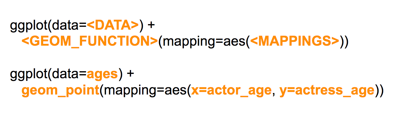
ggplot is very powerful and has many options. There are also different ways to build a ggplot, so the data and mapping noted below can be in different places. Below is how the PDS video explains how to structure the code.
The basic types of information include:
your data: what dataset will you use
the type of graph you will create: the geom_type
and the variable(s) that you want to use: the mapping and aesthetics
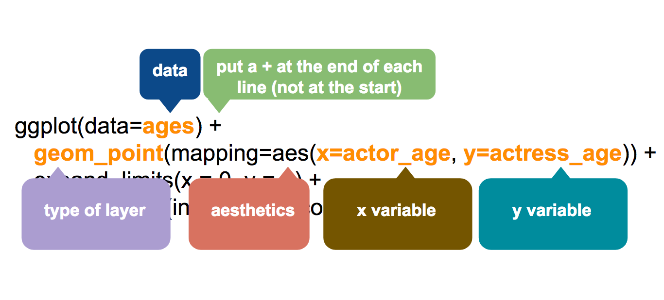
This second illustration labels the key parts of the code you will use. One other note, in ggplot, you use the + sign and not the pipe |> to connect various parts of your code.
If this makes your eyes glaze over, that is okay. But if you are interested, I can help you work with ggplot instead of gg_blanket.